-25% New
Design System
A comprehensive showcase of all UI components included in Pulse Commerce. Every component is built with accessibility and dark mode support.
Status indicators, tags, and category labels for products and content.
Product cards, blog cards, and flexible content containers.
A simple card with padding and subtle border.
A card with hover lift effect.
A card with accent colors.

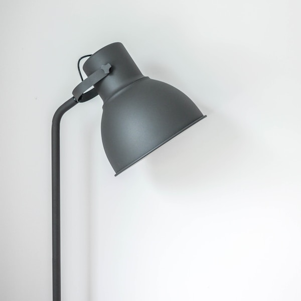
Discover the latest interior design trends that will shape homes this year.
Optimized for peak performance.
Enterprise-grade security built in.
Input fields, selects, checkboxes, and complete form layouts.
Please enter a valid email address.
Success, warning, error, and informational message components.
Information
This is an informational message for the user.
Success
Your action was completed successfully.
Warning
Please review this information carefully before proceeding.
Error
Something went wrong. Please try again later.
New Feature Available
Check out our new product comparison tool!
Price displays, discounts, sale badges, and cart summaries.
Selected: Large / Walnut
Friendly messages for empty carts, search results, and lists.
We couldn't find any products matching "vintage lamp". Try different keywords.
Browse All ProductsLoading spinners, skeleton loaders, avatars, and helper components.


All components are fully customizable via Tailwind CSS and theme configuration.